
Vibe-coding: From Days to Hours:
From idea to working prototype
in 2 hours instead of days
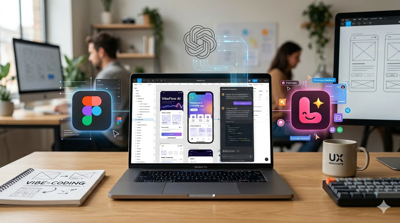
Prompt: “For a hero image for my ux design portfolio with the subject vibe-coding and prototyping, I need an image that shows ai and prototyping. Include logo's from figma, lovable and claude. I'm thinking of a laptop (macbook) with a prototype on the screen, be creative with the logo's, maybe they can float around the laptop. Still it needs to be professional and suitable for a ux portfolio.”
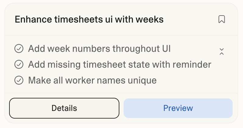
Kicking Off the Timesheets Epic
During a product meeting, attended by product managers and fellow UX designers, our team set out to define the approach for a new epic: Timesheets. The goal was straightforward: align on scope, surface key interaction challenges, and establish a shared understanding of how the feature should work before committing to a full design cycle.
Traditionally, this kind of alignment takes days. Designers sketch concepts, iterate internally, present to stakeholders, collect feedback, and revise — a cycle that can stretch across an entire sprint before a single validated prototype exists.meeting needed: a concrete starting point.
The Experiment: Prompting in Real Time
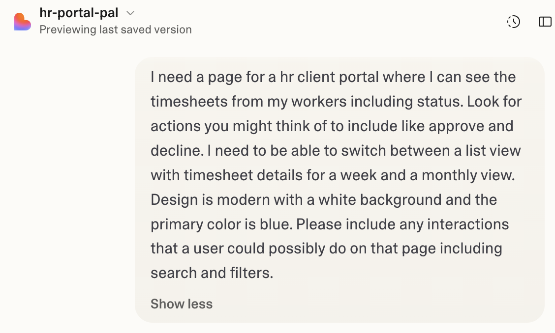
Midway through the meeting, I decided to try something different. Instead of scheduling a follow-up session to present early concepts, I opened Lovable and wrote a quick prompt on the spot — right there, in the room, with the team watching.
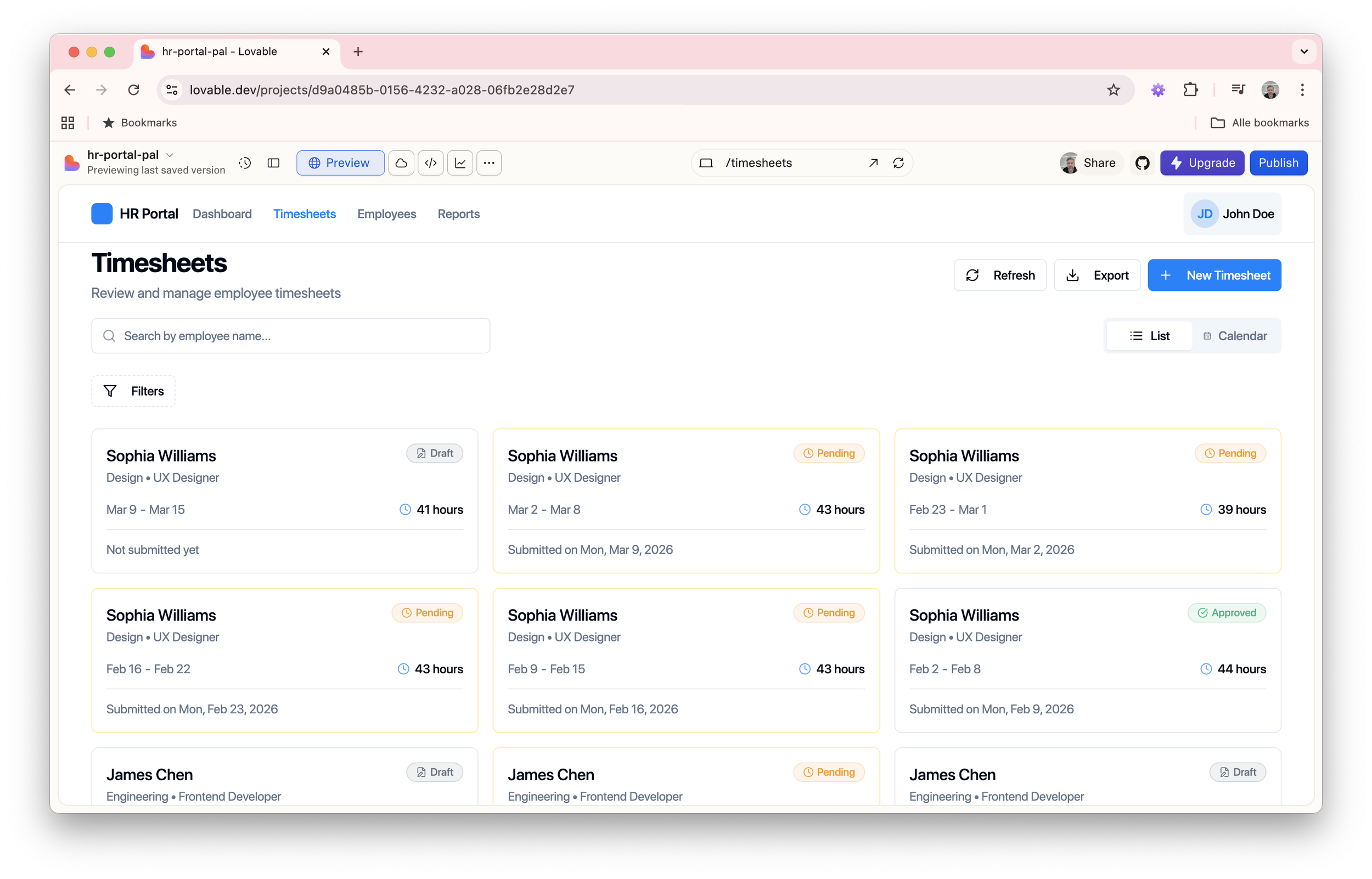
The outcome was impressive. Within minutes, we had a working, interactive prototype of a timesheet interface — something tangible to react to, discuss, and challenge. It wasn't perfect, and it wasn't meant to be. But it gave us exactly what the meeting needed: a concrete starting point.
Impact in the Room
Having a live prototype as a discussion artefact fundamentally changed the dynamic of the meeting. Rather than debating abstract concepts or wireframe sketches, the team could point at real interactions and ask real questions:
How should time entries be submitted — inline or via a modal?
What happens when a user edits a previously approved entry?
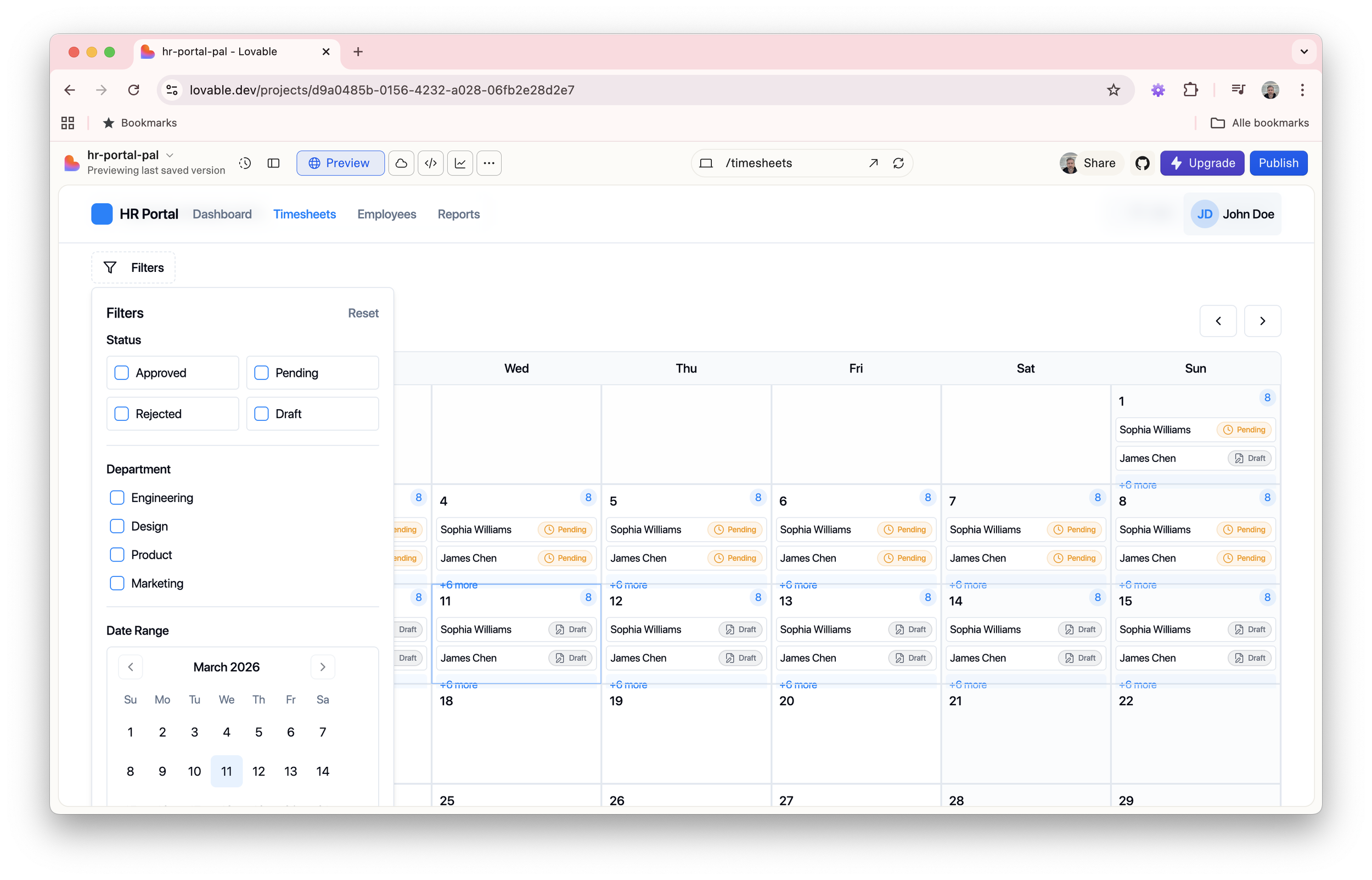
How do we visualise weekly vs. monthly views?
These were questions we would have struggled to articulate without something to look at. The prototype gave us a shared visual language — and with it, significantly more productive conversation.
Honest Assessment: What Was Missing
The AI-generated prototype was a strong foundation, but it came with clear limitations. Several interaction patterns were absent or underdeveloped:
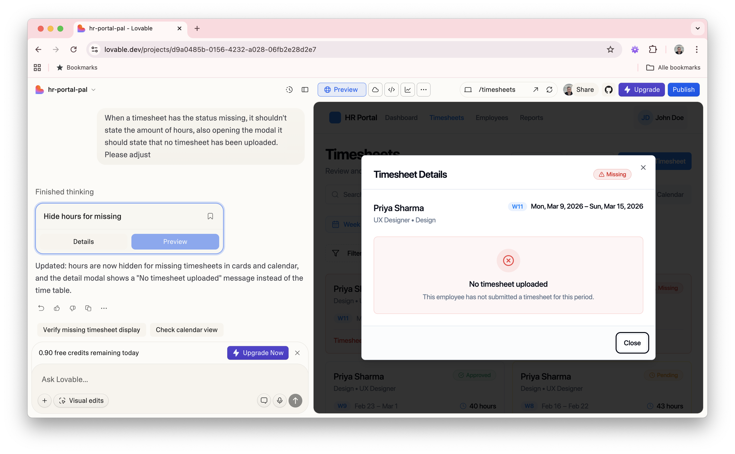
Missing timesheet reminders — There is no notification or reminder system to alert users when a timesheet has not been submitted by the deadline. This is a critical workflow gap for both employees and managers.
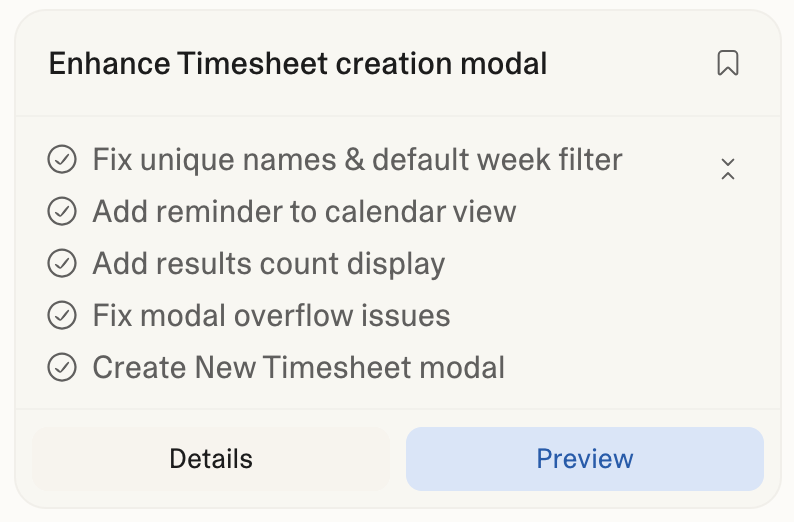
"New Timesheet" button — unclear trigger — The button exists, but the interaction behind it is undefined. It's unclear whether it opens a modal, navigates to a new page, or pre-fills a form based on the current week. The expected behaviour needs to be designed and documented.
Empty & results states — When no timesheets exist or a search/filter returns nothing, there is no empty state to guide the user. These states are essential for a polished, production-ready experience.
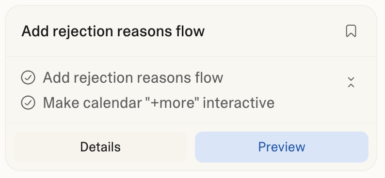
Rejection flow — predefined reasons — The prototype lacks a rejection mechanism. When a manager rejects a timesheet, the user should be presented with a structured set of reasons (e.g. incorrect hours, missing project code) rather than a free-text field, ensuring consistency and auditability.
Week number display — Week numbers are absent from the interface, which is a significant oversight for a time-tracking tool — particularly in European work contexts where week numbers are a primary reference point for planning and reporting.
Calendar interaction — undefined click behaviour — The calendar component is present but passive. It's unclear what happens when a user clicks on a specific day or week. Does it navigate to that period? Does it allow inline entry? This interaction needs to be defined.
Adding individual time entries — no clear entry point — It is not obvious where or how a user can log a single time entry within an existing timesheet. The path to this action needs to be surfaced more explicitly in the UI.
Fixing What the AI Got Wrong
The prototype impressed the room, but daylight is the best disinfectant. Once the excitement of the meeting settled, I sat down with the output properly and started cataloguing what wasn't working, not as failures, but as design problems worth solving.
The rejection flow that wasn't there
I prompted Lovable to introduce a structured rejection flow: upon clicking reject, the manager is presented with a set of predefined reasons — such as incorrect hours logged, missing project code, or entries outside the billing period. The employee then receives the rejection alongside the selected reason, giving them everything they need to correct and resubmit.
Other issues fixed:
Reflection: Rethinking the Design Timeline
What used to take days — aligning on approach, creating initial concepts, presenting to stakeholders, iterating on feedback — now takes a matter of hours. AI-assisted prototyping doesn't replace the craft of UX design; it compresses the early, most uncertain phase of it.
The value isn't in the output itself, but in what it enables: faster alignment, earlier feedback, and more time spent solving real design problems rather than building scaffolding. For teams working in fast-moving product environments, this shift is significant.
This experience has changed how I approach discovery and ideation. The prompt is now part of my design toolkit.
Impression of the prototype:
⚠️
This prototype was built as a design exploration, not a finished product. You may encounter some rough edges in styling and interactions — these are known and actively being refined. Consider this a living artefact, not a final deliverable.