Global Client Portal
My role
My role in the rollout of the Global Client Portal was to lay a solid, future-proof design foundation. When I joined the project, I conducted a thorough assessment and advised linking the portal to the central Randstad design system.
This strategic turning point led to a completely new start, where I was responsible for designing a responsive grid, optimized navigation, and reusable custom components. This project resulted in a scalable, accessible, and uniform portal that is ready to be rolled out globally to 38 countries.
Project overview
Product Team: Product manager (1), Product Owners (2), Program Manager (1), Business Analist (3), Implementation Managers (2)
Dev Team: Front-end Developers (4), Back-end Developers (8), Testers (4)
Close collaboration with: Design Manager (1), Strategic Designer (1), UX Designers (2)
Duration project: 2-3 months (for this part of the project)
Tools: Figma, Miro, Jira & Google Sheets
Soft skills: Stakeholder Management, Collaboration & Presenting
Phase 1: Problem Definition
When I joined the Global Client Portal project, the initiative had already been underway for six months. Although foundational design work had begun, the solution lacked consistency, scalability, and alignment with business standards.
The main issues included:
❌ No unified design system
Multiple design approaches were used across pages and modules, resulting in visual inconsistency and unclear interaction patterns. There was no shared component library to guide new feature development.❌ Limited accessibility compliance
Existing screens were not aligned with the latest WCAG standards. Challenges included insufficient color contrast, unclear focus states, and inaccessible form controls, which created barriers for users with assistive devices.❌ Not aligned with Randstad brand guidelines
The visual identity varied across screens—typography, colors, and iconography did not consistently reflect Randstad’s brand guidelines, affecting product trust and recognition.❌ Not scalable for other brands
Designs were highly specific to one brand and could not be easily adapted or themed for Randstad’s sub-brands or regional variations. This posed future maintenance and rollout challenges.❌ Code and components were built from scratch and not reusable
The development team created custom components without aligning to an existing shared codebase. As a result, components were not interchangeable with other teams and lacked scalability, slowing development and increasing maintenance effort.
As a result, the portal risked delivering an inconsistent experience, causing inefficiencies for internal teams and confusion for clients. A unified, scalable, and compliant design approach was needed to support a long-term global product strategy.
Phase 2: Stakeholder Management
When the gaps in design and development became clear, it was essential to align key stakeholders, including product owners, design leads, and engineering managers, around the need for foundational changes.
Rather than positioning previous work as “wrong,” I focused on communicating why a new approach would reduce long-term risk and better support business goals.
My Approach
1️⃣ Evidence-based storytelling
I conducted an audit of the existing portal, reviewing the UI, code, and accessibility gaps. I synthesized the findings into:
👉 A visual comparison of inconsistent screens
👉 Accessibility compliance evaluation (WCAG 2.2)
👉 Brand alignment scorecard
👉 Analysis of code reusability across teams
This allowed stakeholders to clearly see the current state and its limitations.
2️⃣ Framed the conversation around future value
Instead of emphasizing what had been done “incorrectly,” I positioned the redesign as an opportunity to:
✅ Create a unified experience across global markets
✅ Reduce long-term development effort through reusable components
✅ Improve accessibility and inclusivity
✅ Ensure consistent brand expression
3️⃣ Showed the cost of inaction
I outlined risks of continuing with the current approach:
⚠️ Higher maintenance costs
⚠️ Difficulties onboarding new teams
⚠️ Fragmented user experience
⚠️ Inability to scale to other Randstad brands
⚠️ Not being compliant with accessibility standards (WCAG 2.2)
Presenting these risks helped stakeholders understand the business implications.
4️⃣ Introduced a scalable solution: a centralized design system
I recommended building on an existing centralized design system to:
💡 Standardize components
💡 Reduce duplication of code
💡 Increase development speed
💡 Improve design & developers collaboration
💡 Beneficial for other teams within Randstad
I shared examples of how other teams could reuse components, creating organizational efficiency.
5️⃣ Collaborative alignment sessions
I organized meetings with design, engineering, and team managers to:
💪 Validate the challenges
💪 Prioritize needs
💪 Define a shared vision and principles
These sessions helped build support and ensured the proposal wasn’t seen as “my decision,” but a shared direction.
🚀 Outcome
Stakeholders agreed that restarting with a unified design system would better support scalability, accessibility, and consistent brand expression. This created alignment across teams and laid the foundation for future components and patterns to be shared across the organization.
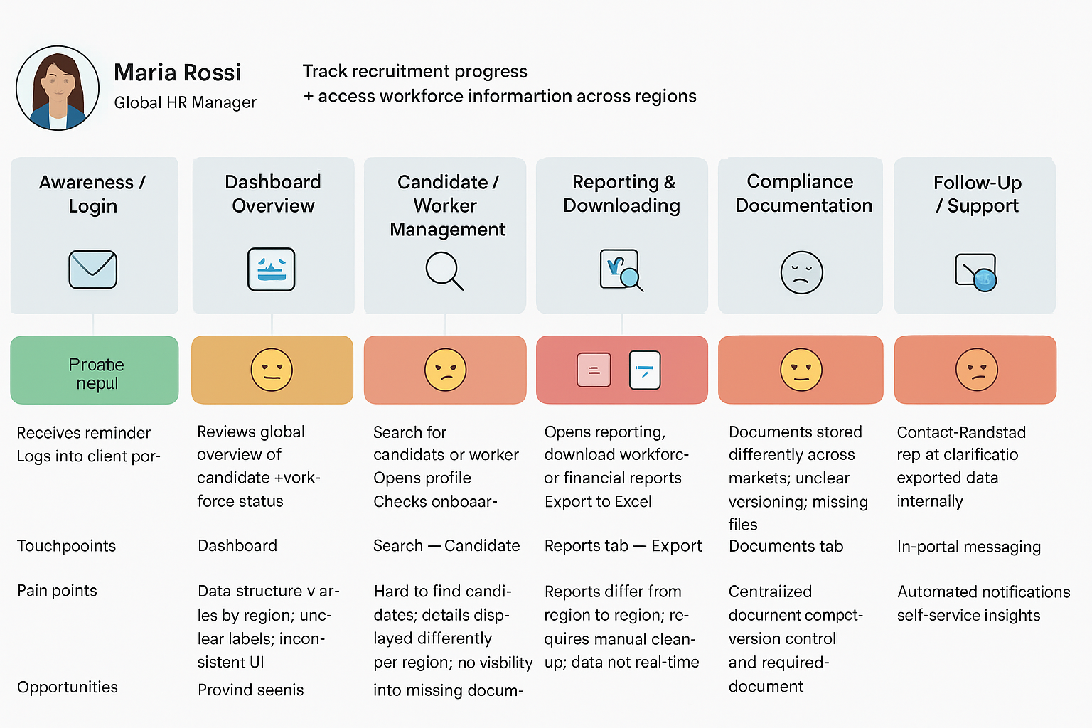
Phase 3: User & Internal Research
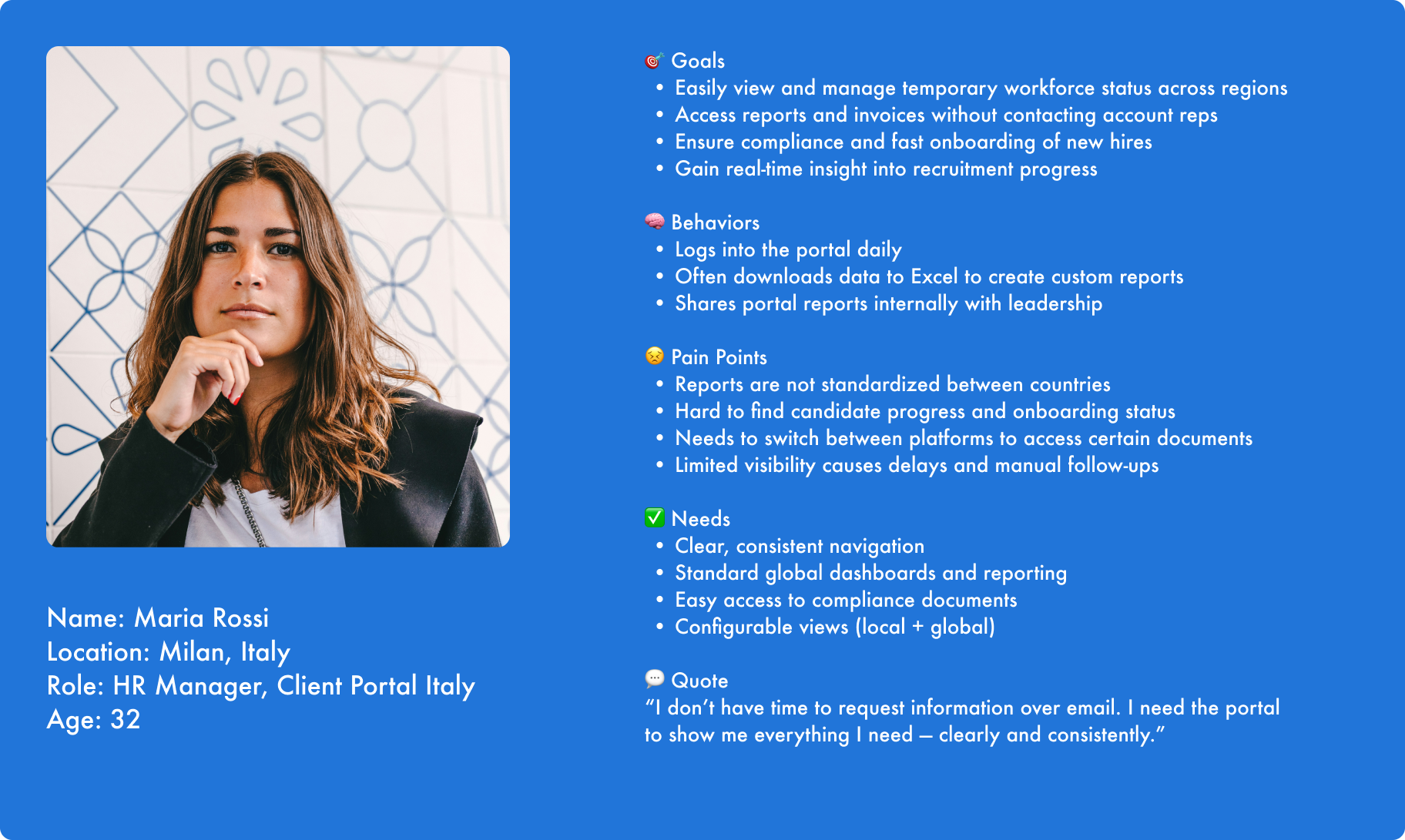
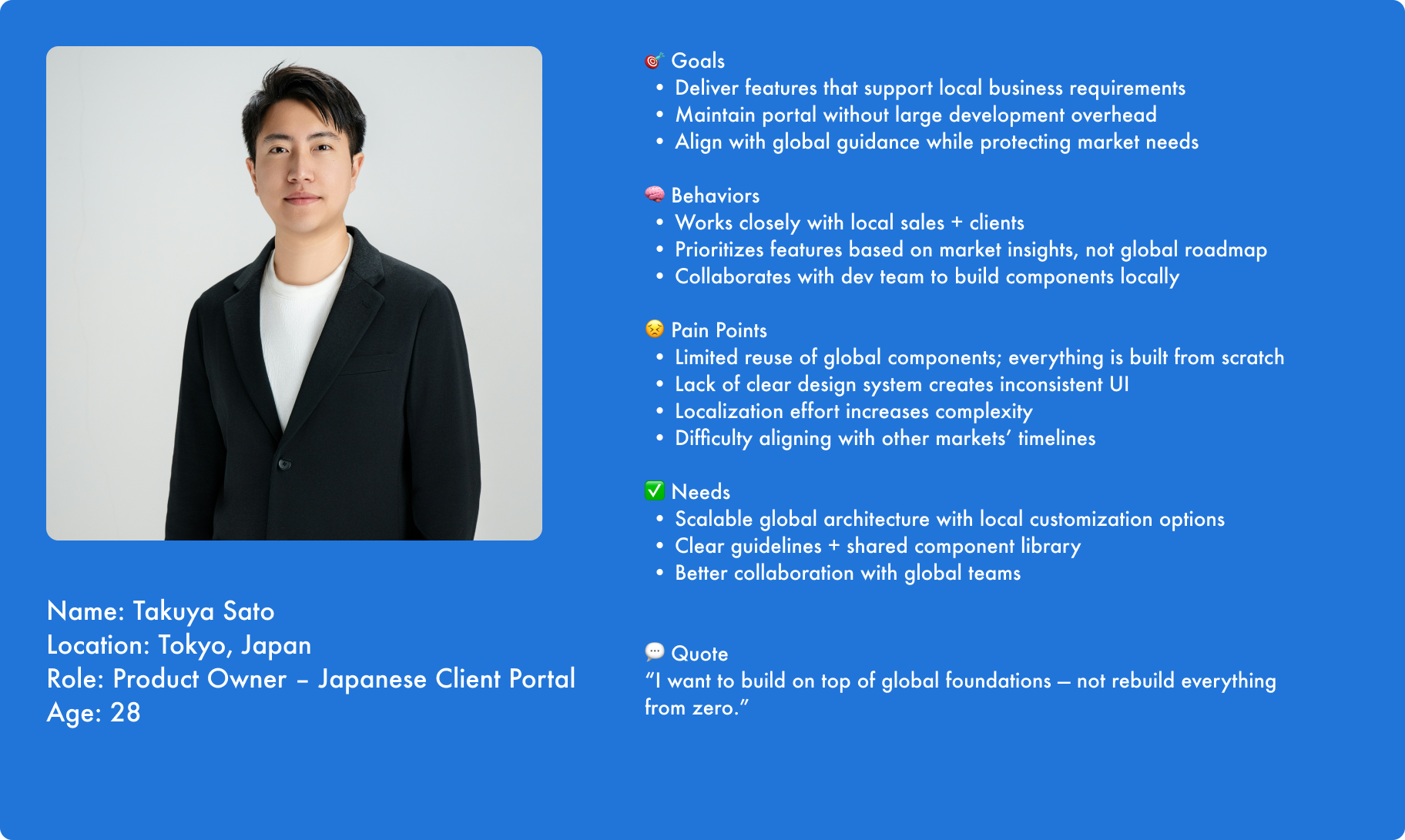
To better understand how the Global Client Portal was being used and implemented across markets, we conducted interviews with both end-clients and local product teams from Italy and Japan.
These markets were prioritized because they had already launched versions of their portals and could provide insights into functionality, adoption, and pain points.
Goals
👉 Understand current portal workflows and business processes
👉 Identify gaps and workarounds used by clients and internal teams
👉 Learn which features deliver the most value in real usage
👉 Capture regional differences to inform global scalability
👉 Identify opportunities to streamline or unify functionality
Method
1️⃣ Client Interviews
We interviewed key users from Italian and Japanese client organizations who regularly interacted with their local portals.
Focus areas:
💡 How they use the portal in daily workflows
💡 What tasks they find easy vs. difficult
💡 Missing features / workarounds
💡 Interaction pain points (e.g. navigation, content clarity)
💡 Regional needs or compliance considerations
Outcome:
This helped us understand real-world usage patterns and prioritize the most important features to include globally.
2️⃣ Product Team Interviews
We also met with product owners and design/development teams from Italy and Japan.
Focus areas:
💡 Functionalities implemented locally
💡 Technical architecture and integration
💡 Why certain design or UX decisions were made
💡 Local branding/customization requirements
💡 Challenges maintaining or scaling the portal
🚀 Outcome:
We learned how each region adapted the portal independently and where their solutions could be standardized for global use.
Key Findings
✅ Duplicate features were built separately in different markets
✅ Functionalities varied by region, making product experience inconsistent
✅ Local business rules drove different UX flows
✅ Teams lacked shared components and design documentation
✅ Some features were highly valued in one market and missing in the other
✅ Custom codebases made reuse difficult
✅ Client users often relied on offline tools (Excel, email) to fill functional gaps
Impact of Research
💪 Highlighted the need for a modular design system supporting regional customization
💪 Provided insight into shared core functionality for a global MVP
💪 Exposed opportunities to streamline duplicated efforts
💪 Ensured future design decisions were grounded in real user needs
💪 Built trust with product teams by acknowledging their input and solutions
This research phase validated that the portal required:
a globally consistent foundation with localized flexibility — not isolated, market-specific builds.
First deliverables 👇
Personas - Journey Map - User flow - Release plan
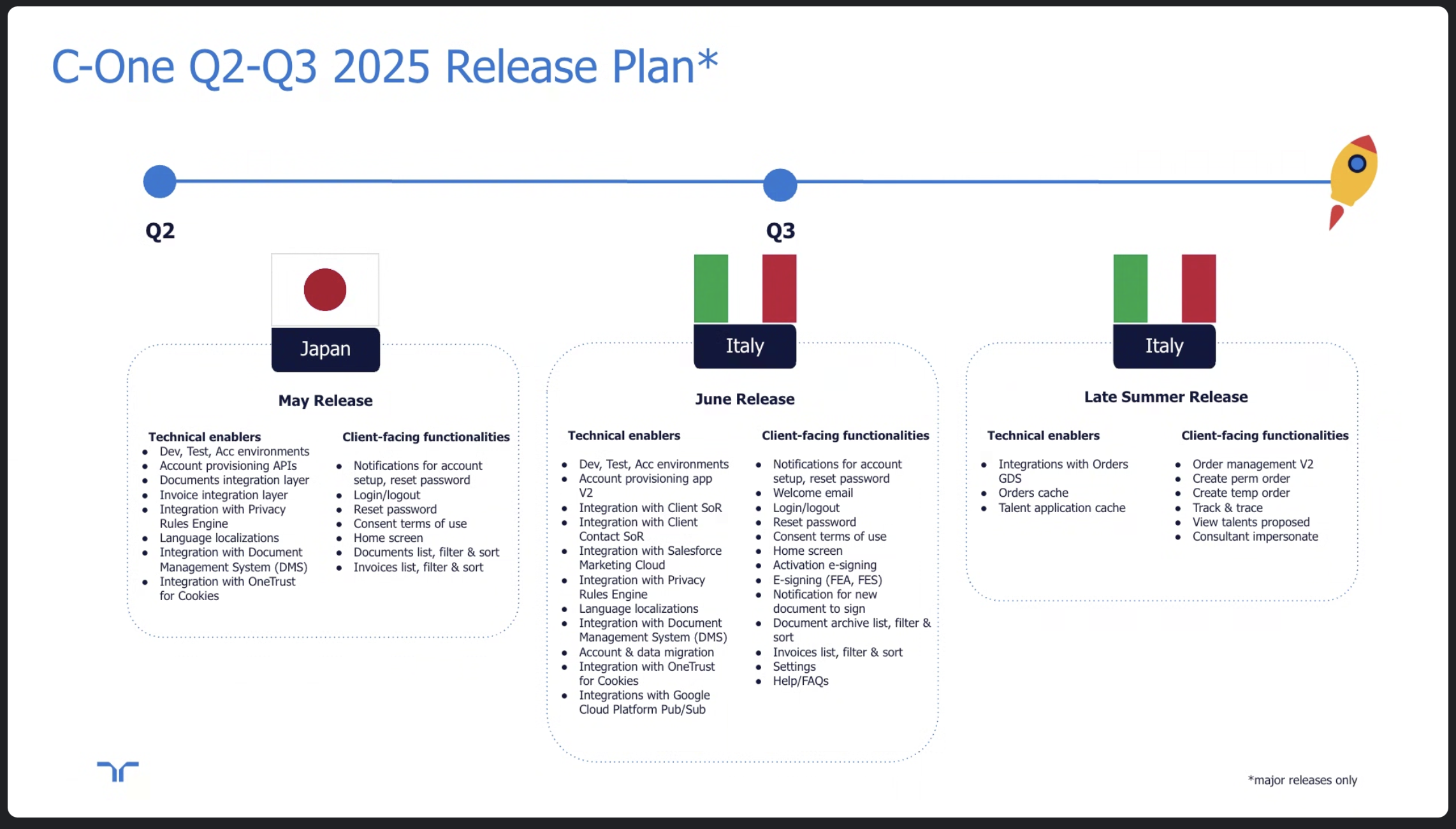
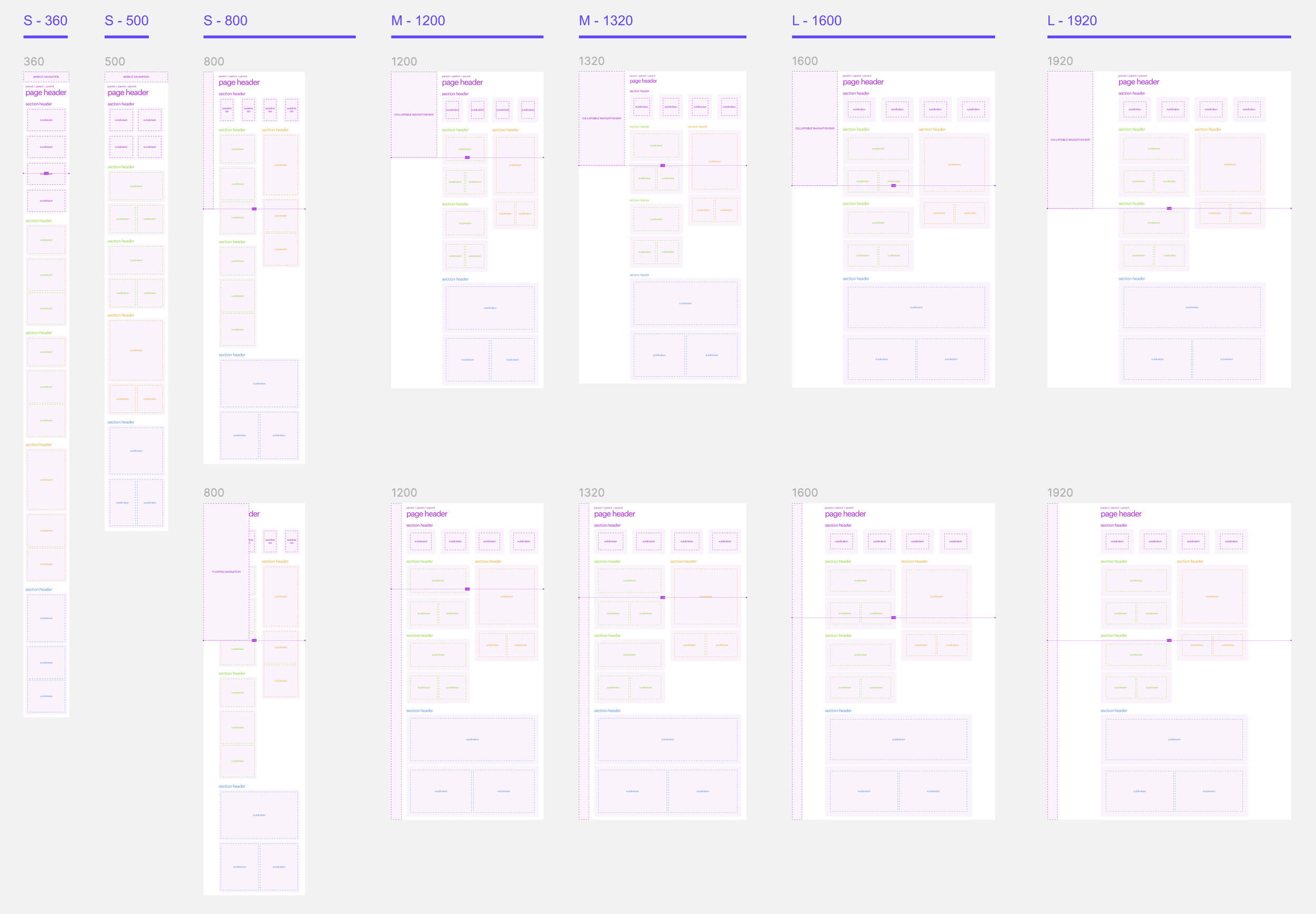
Phase 4: Setting Up The Responsive Foundation
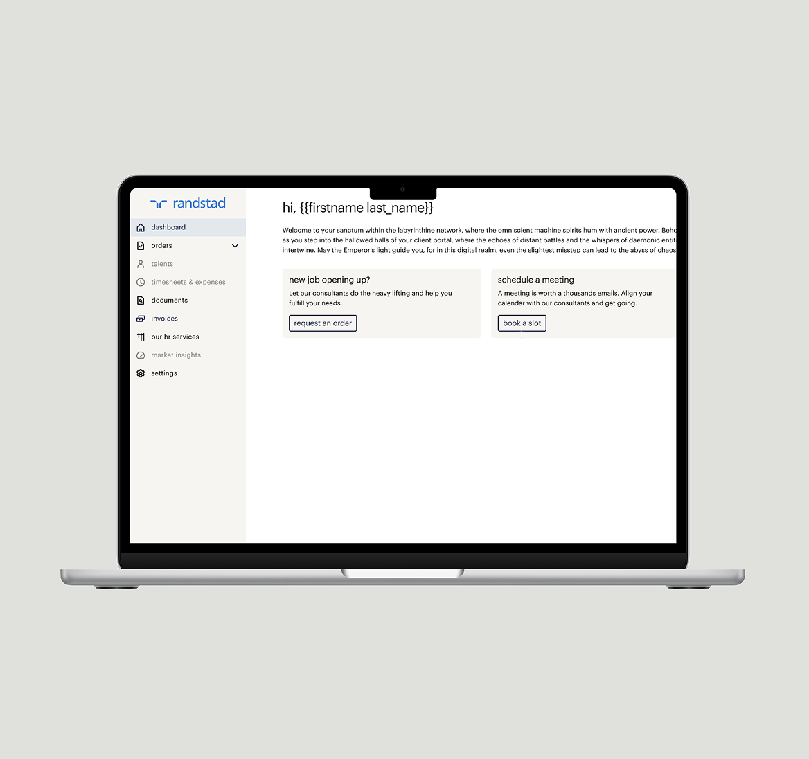
In this phase, my focus was on building the fundamental components of the portal. The core task was to design a new responsive grid system and an optimized navigation. The primary goal was to ensure the portal would provide a smooth and intuitive experience on all devices, especially on mobile, so clients could easily perform crucial tasks like requesting personnel.
I worked closely with the Design Manager, a Strategic Designer, and another UX Designer to make the right strategic and creative decisions.

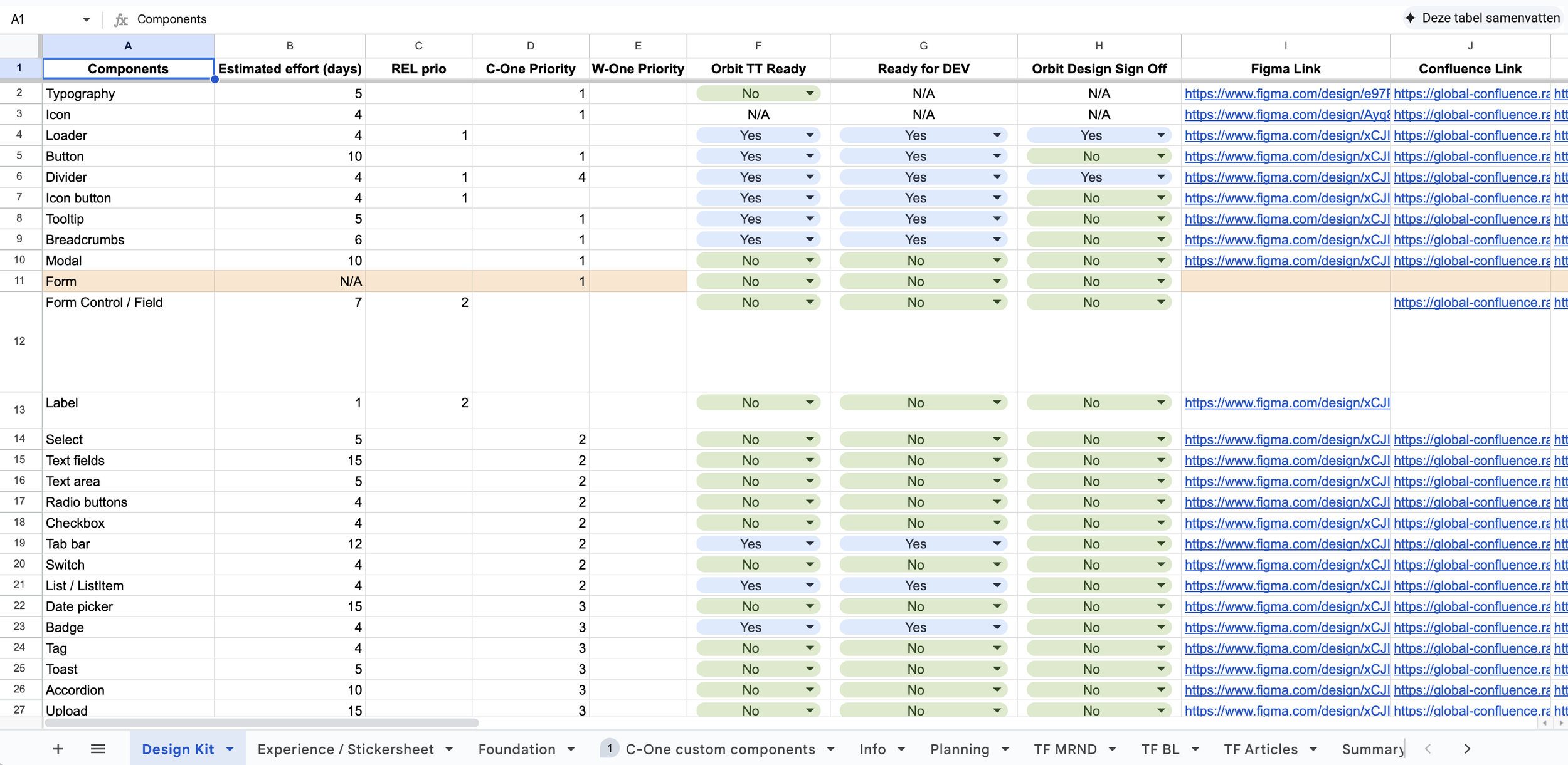
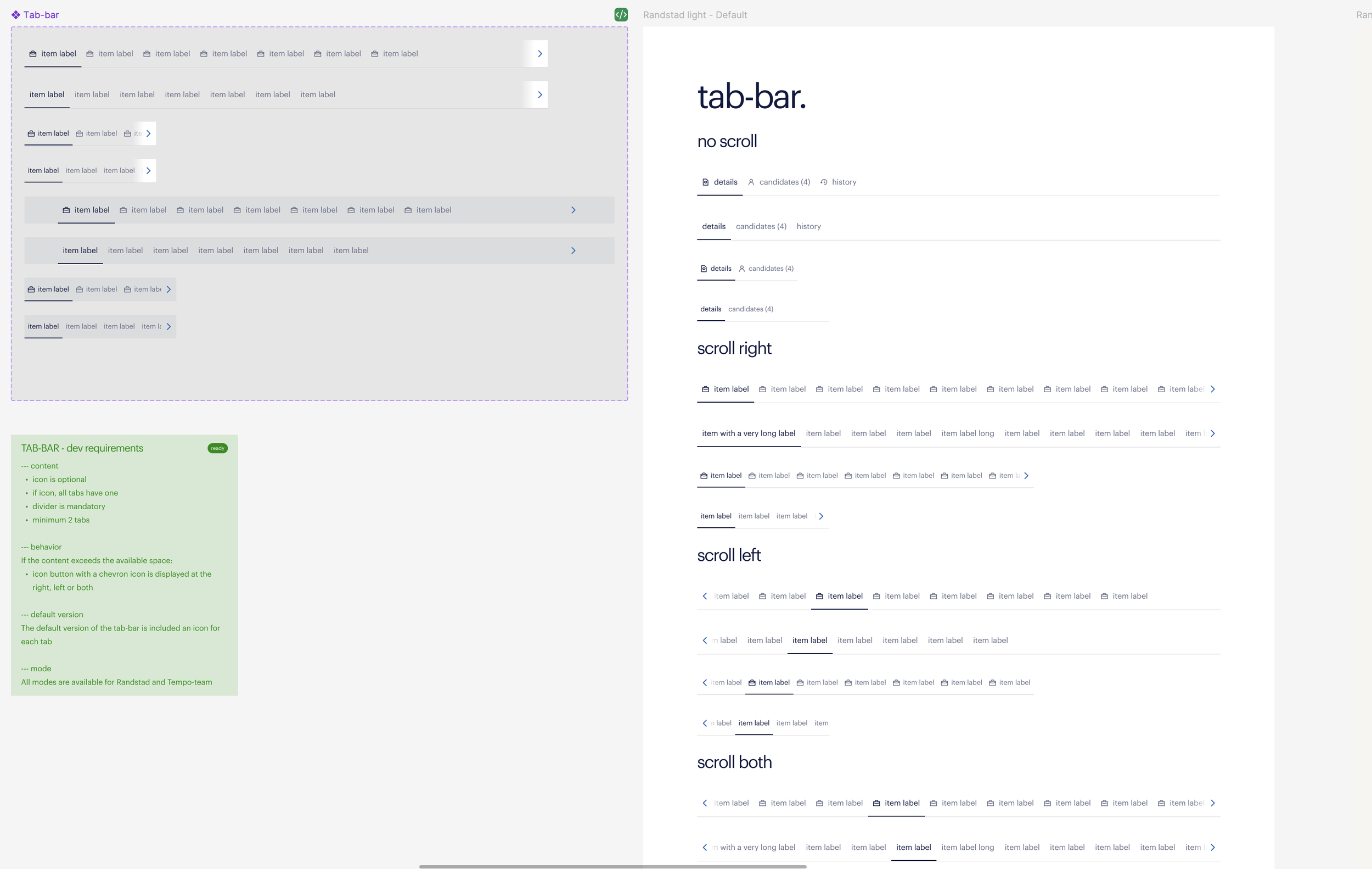
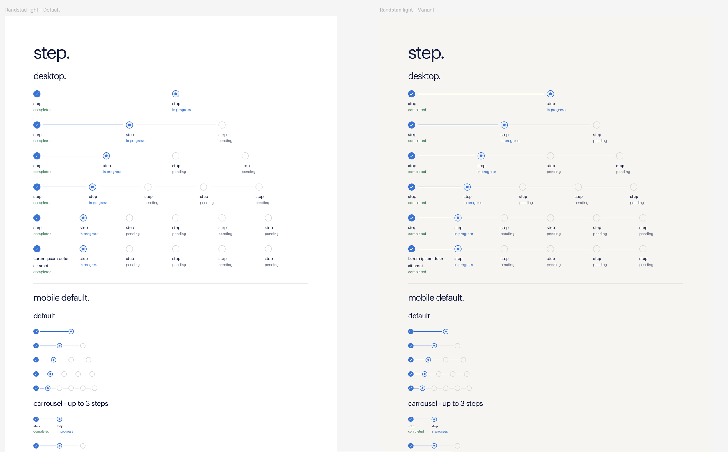
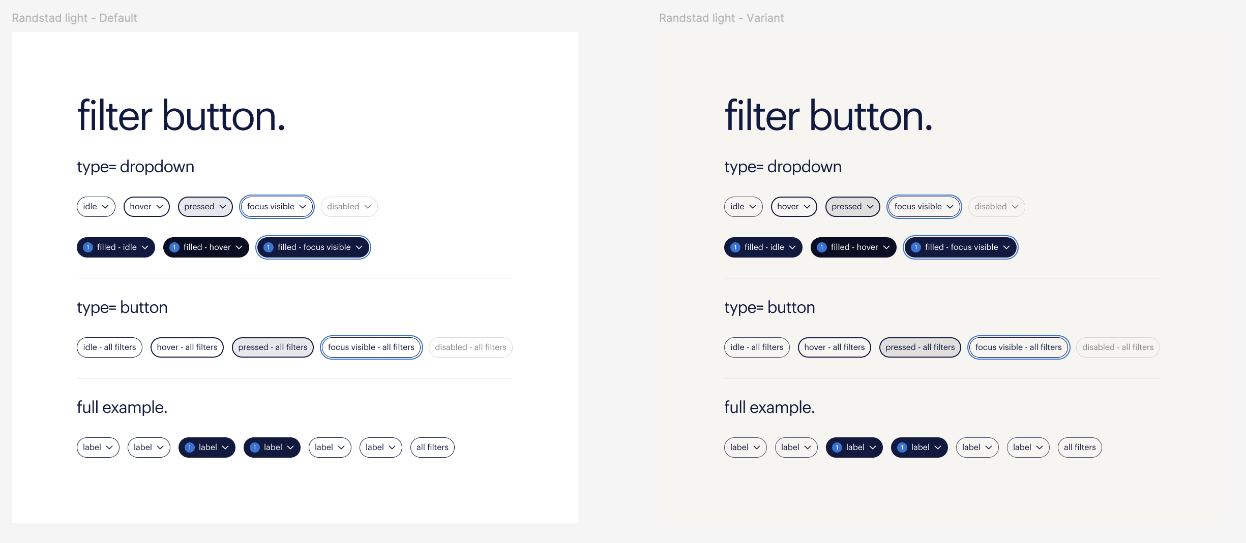
Phase 5: Collaboration and Enriching the Design System
In this phase, I worked closely with the development team and the design system team to map out the necessary components for the portal. The focus was on a strategic approach to the design: we inventoried which components were already available and which unique, custom components we needed to build. This was crucial to prevent resource waste and ensure consistency.
Furthermore, the collaboration ensured that the newly designed components were made reusable and were added to the central design system. In doing so, we not only created a robust solution for our project but also made a valuable contribution that increased efficiency and scalability for other teams within the organization.
Deliverables 👇
Custom components for design system
Phase 6: Building a Scalable and Responsive UX Foundation
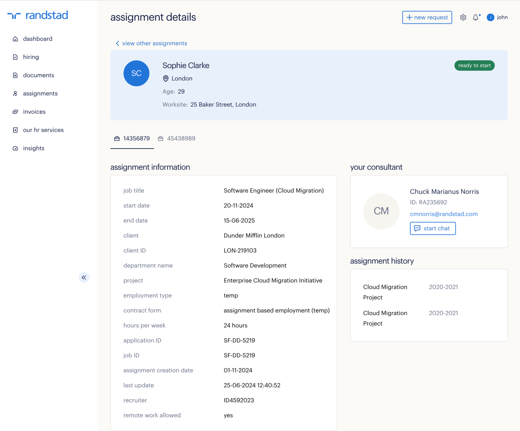
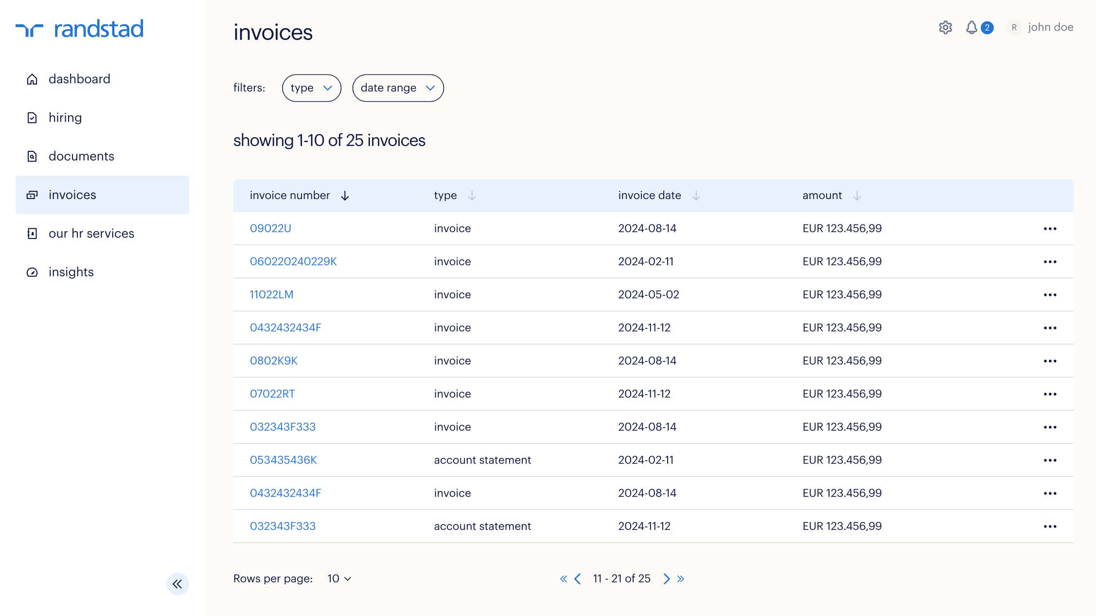
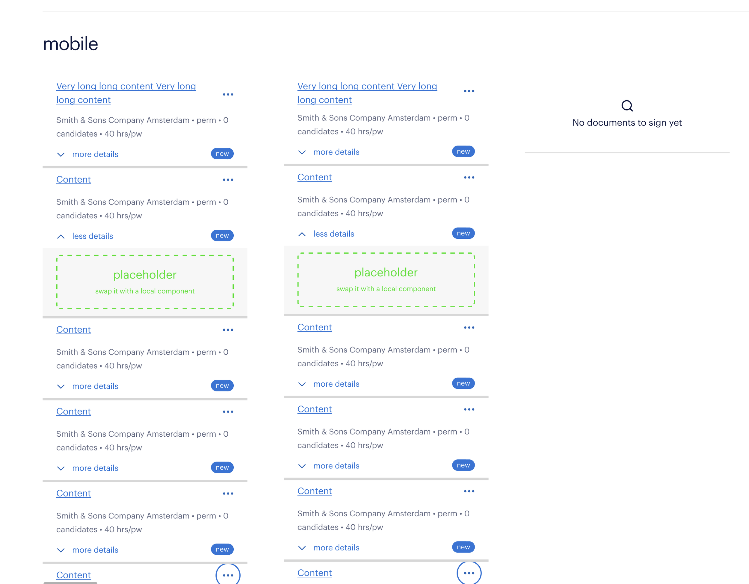
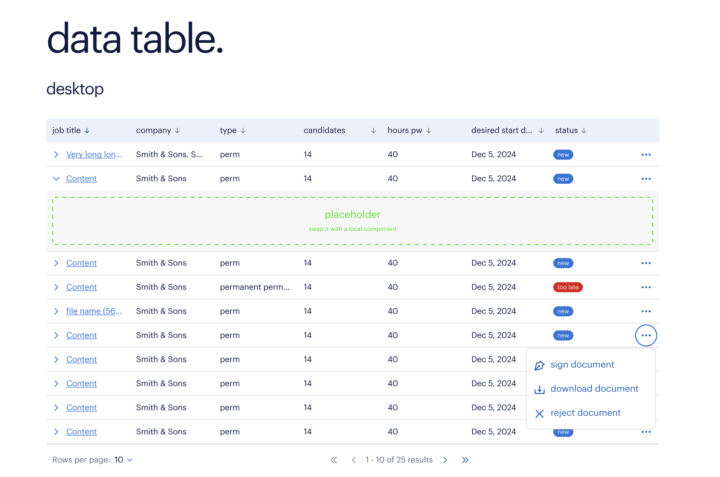
In this phase, the focus was on actually designing the portal within the new design foundation. The biggest challenge was making the responsive grid system work and translating the desktop experience to mobile. To achieve this, I used cards as a scalable component that simplified the interface on mobile.
An even bigger challenge was tackling the heavy data tables, which played a crucial role in the portal. I worked on making these complex tables responsive and developing specific interactions that function well on both desktop and mobile. This required close collaboration with another UX Designer to find innovative solutions that offered a consistent and usable experience on any screen.
Deliverables 👇
Responsive designs for the client portal
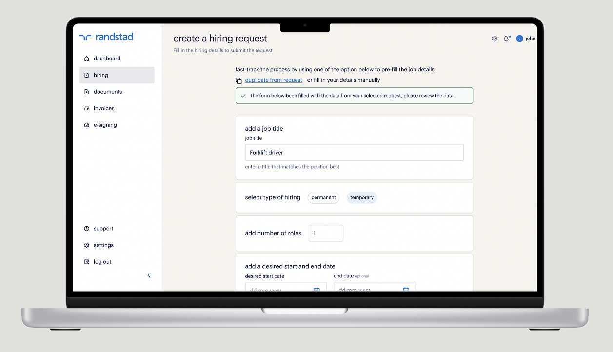
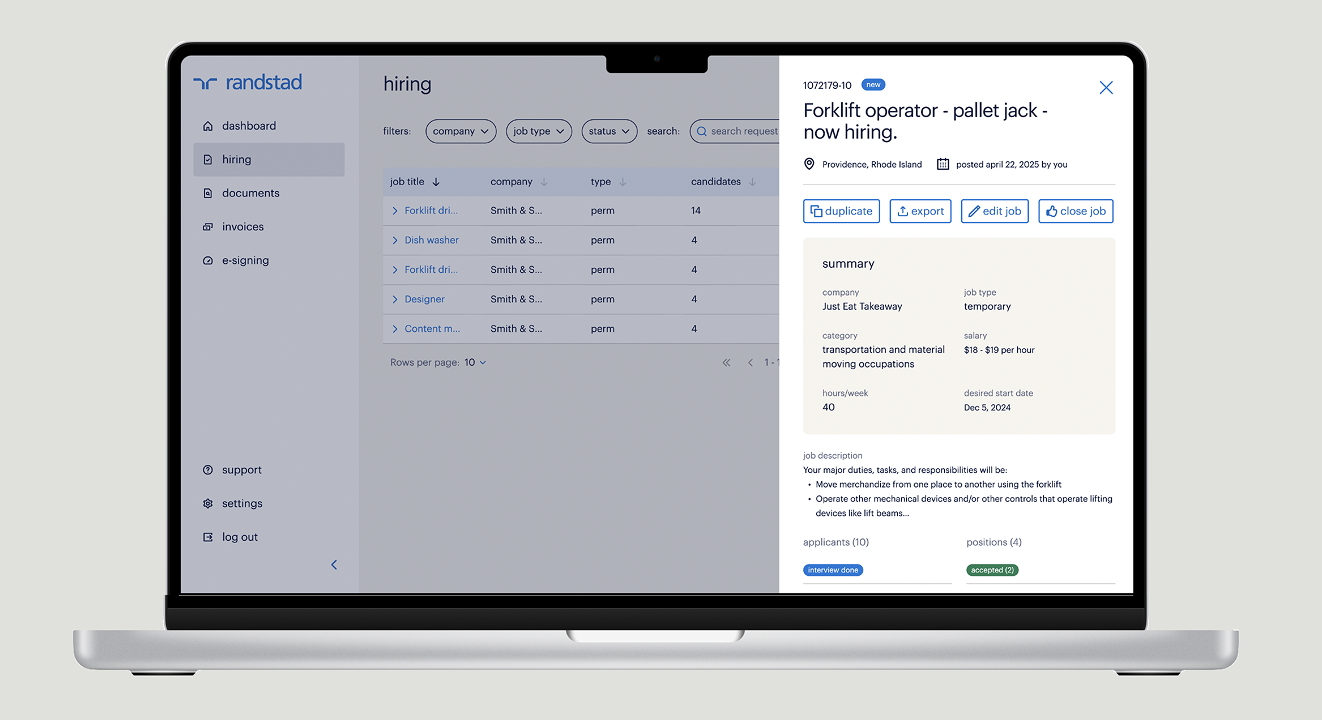
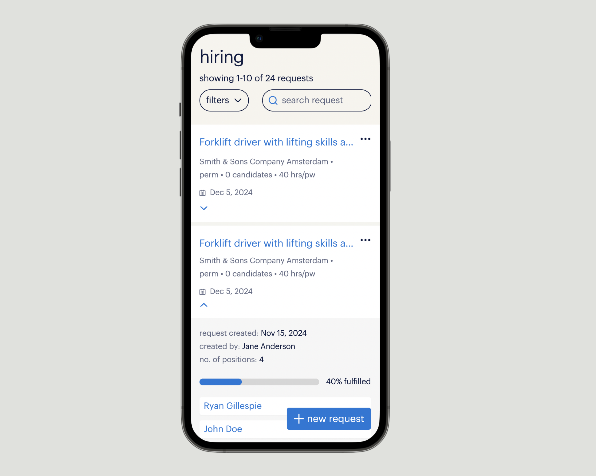
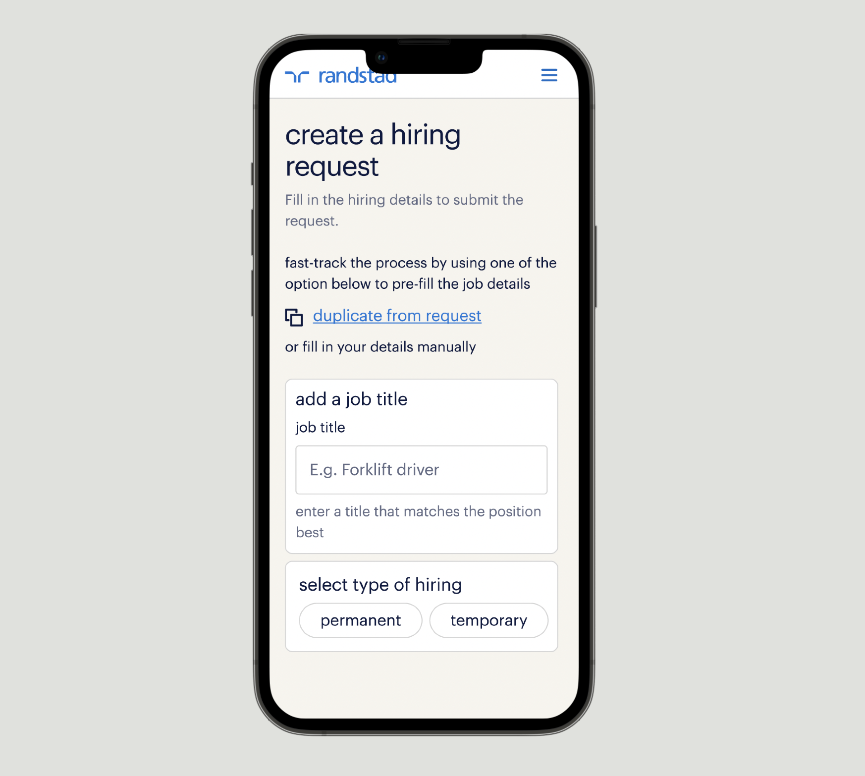
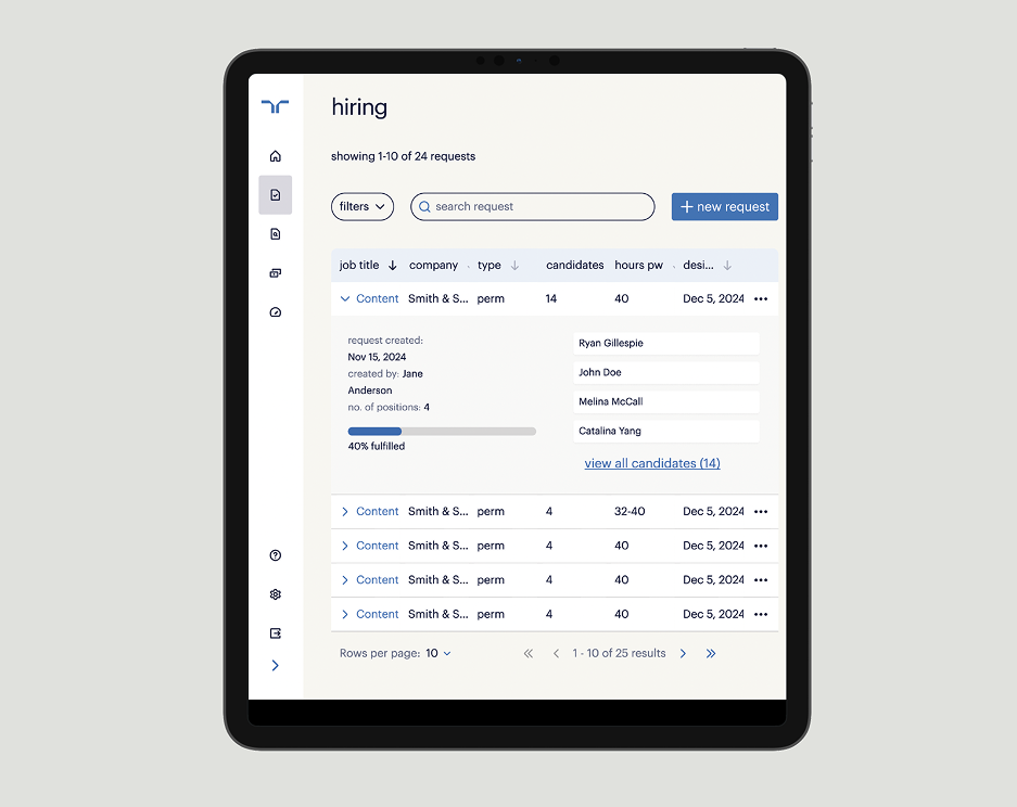
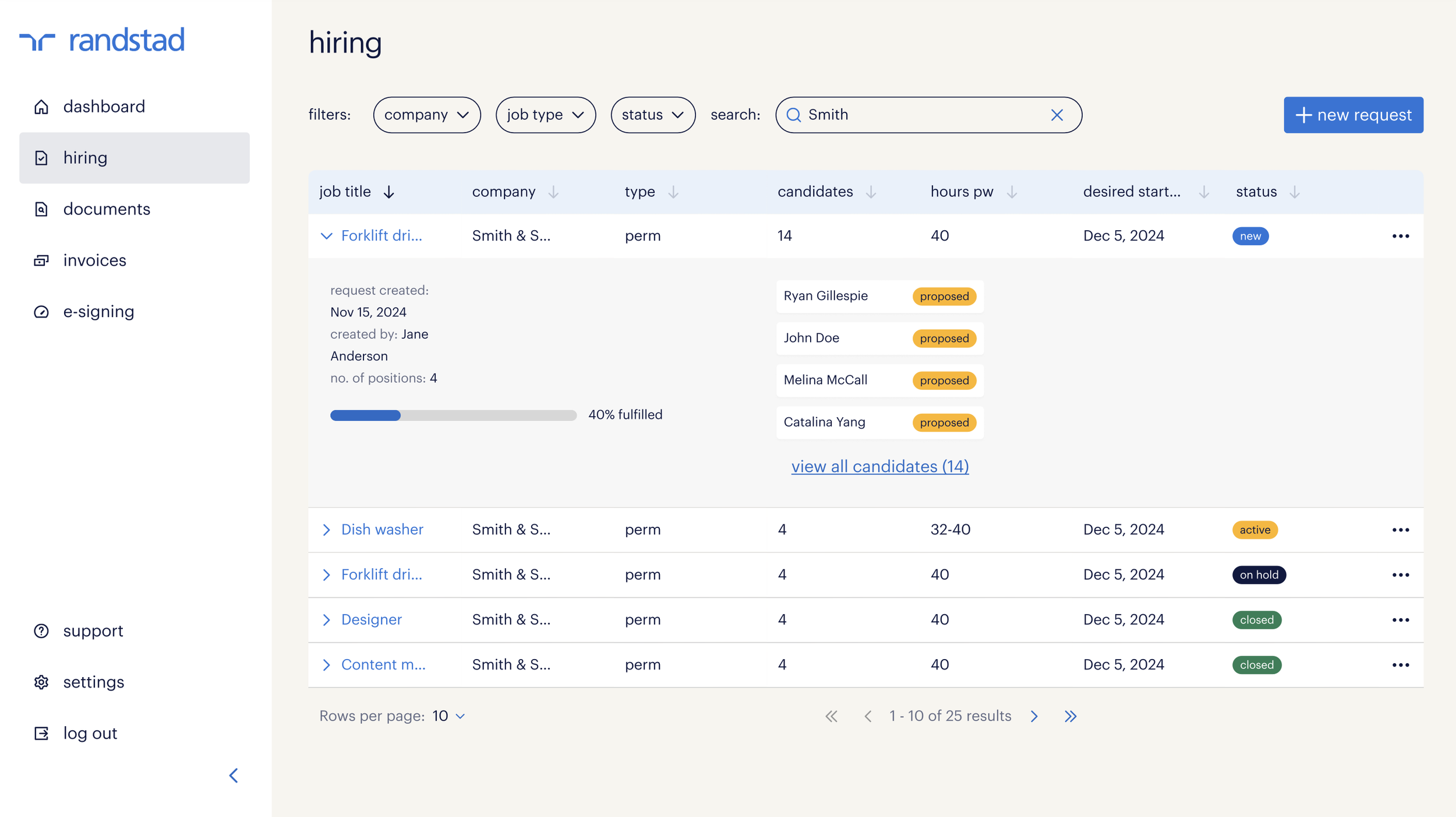
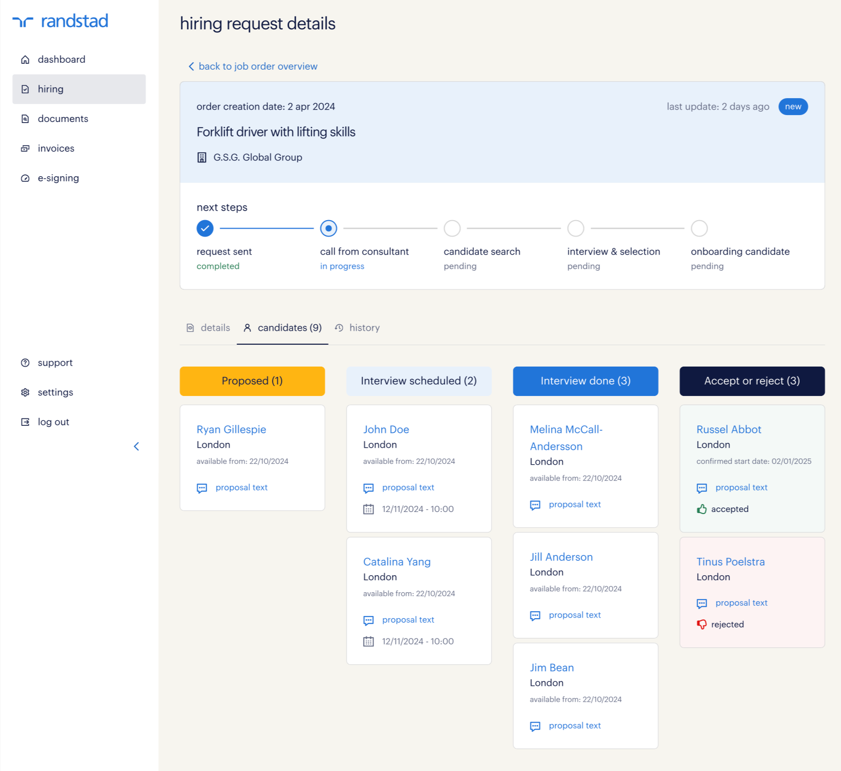
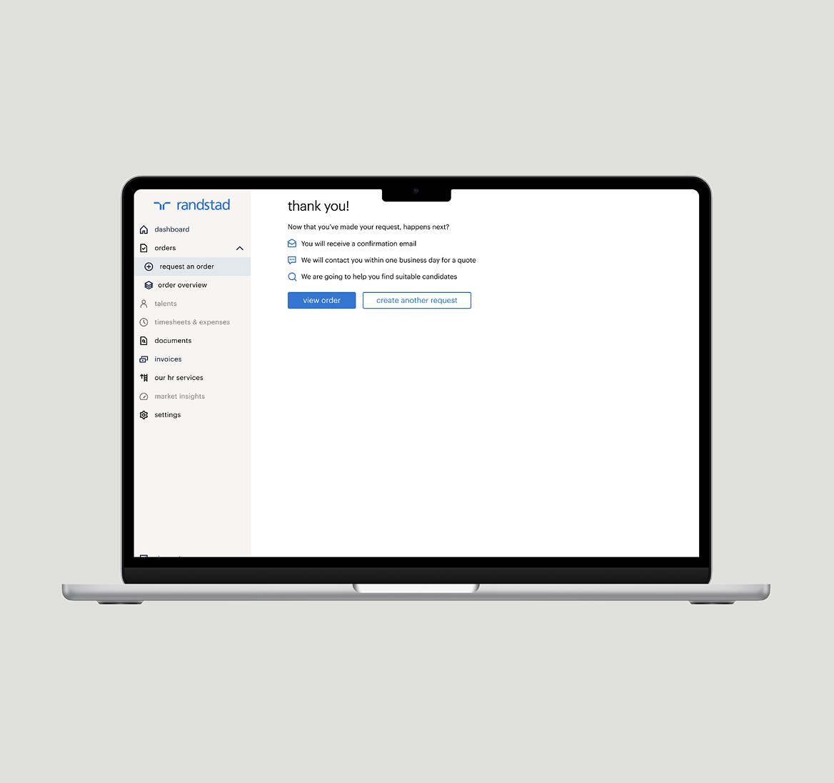
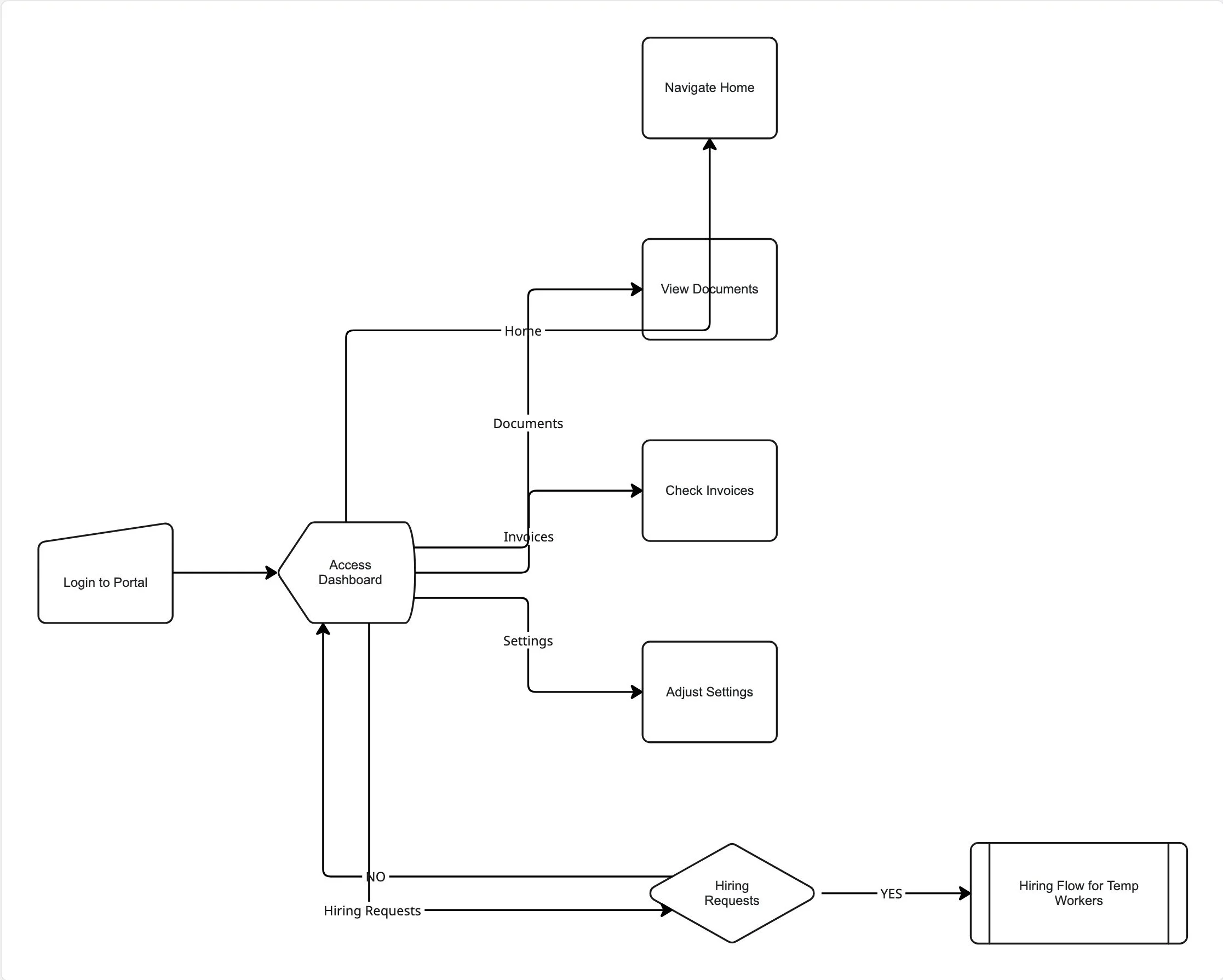
Phase 8: User Testing Portal & Hiring Flow
To validate early design concepts and ensure the hiring journey was intuitive, we conducted multiple user tests focused on the end-to-end Hiring Request flow, from landing on the dashboard, submitting a hiring request and to reviewing its details.
🎯 Objectives
💡 Evaluate clarity of the hiring request workflow
💡 Identify usability issues and navigation friction
💡 Validate content hierarchy and information clarity
💡 Understand whether users could complete the task without guidance
💡 Prioritize improvements based on user behavior and feedback
🔑 Key scenarios tested
💪 Locate “Submit Hiring Request” from the dashboard
💪 Complete the structured form to create a request
💪 Understand next steps / status of the request
💪 View and interpret request details
🙋♂️ My Role
I collaborated closely with our dedicated UX researcher throughout the process.
✅ Created prototypes used in testing (low- → mid- fidelity)
✅ Added UI/interaction annotations for researcher + dev clarity
✅ Participated in session observation
✅ Discussed findings with researcher to validate themes
✅ Iterated on designs to address issues discovered
✅ Delivered updated prototypes for follow-up testing
Phase 7: Implementation & Collaboration with Offshore Development Team
After finalizing the designs, the crucial implementation phase began. My role was to bridge the gap between the design vision and the technical reality by working closely with our offshore development team.
🙋♂️ My Role
I served as the central point of contact for the team, clarifying design specifications and ensuring the designs were built to perfection. Through continuous communication and answering questions about interactions and responsive views, I guided the implementation and ensured the final product met our quality standards. This collaboration was essential for the successful launch of the portal's first version.
🚀 Outcome:
The project culminated in the successful delivery of an entirely new global client portal. The result is a robust and scalable application ready for rollout to 38 countries.
This new design foundation resulted in a portal that is not only responsive for a seamless experience on any device but also meets the latest accessibility standards (WCAG 2.2). By integrating with the central design system, the portal is also fully scalable for multiple brands, which ensures long-term implementation and consistency.